

E-Commerce Redesign:
Jerry’s Art Supply and Framing Wholesale Club
Research
Define
Ideate
Delivery
Intro
What is Jerry’s?
Jerry’s art supply and framing wholesale club is a local business in Greensboro, NC. It’s currently has two separate websites for its sales and about Jerry’s as a company. For this project I focused on the sales site as well as trying to combine the aspects of the company site into one site as well improving the shopping and check experiences of the user.
Process
For this project I used the double diamond method which splits the UX process into 4 phases. 1.research 2.define 3.ideate 4.delivery. research focuses on finding information about the current situation like who uses Jerry’s and what do they use it for? Research also is used to see what others are doing to solve for similar problems. The define phase is used to try and synthesis the data gathered from the research phase into actionable steps. The ideate I used to think of different solutions to solve the users problem. The deliver phase is about what needs to be given off to either present or handed off to a developer.
Goals
Design Goals
To be able to help users of Jerry’s online shop have a better experience.
Two week design sprint.
business goals:
Have clear ways of locating specific products.
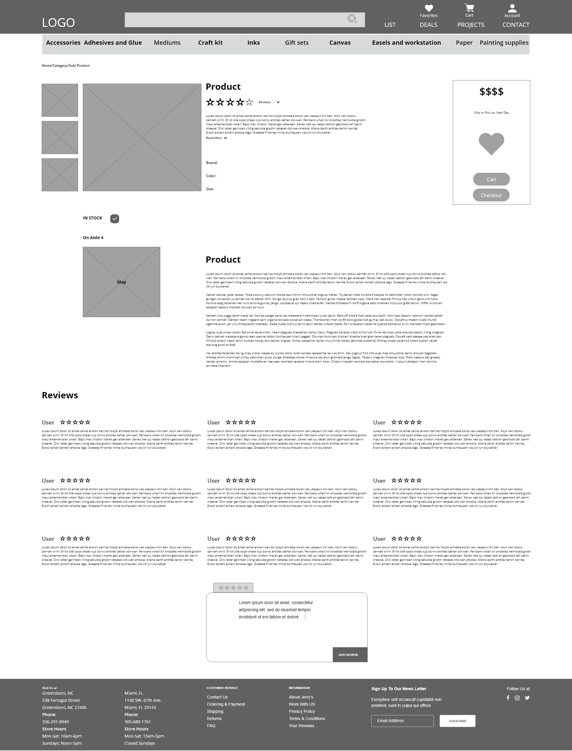
Have a search results, product page and a product description page.
Have an efficient way of purchasing one or more products.
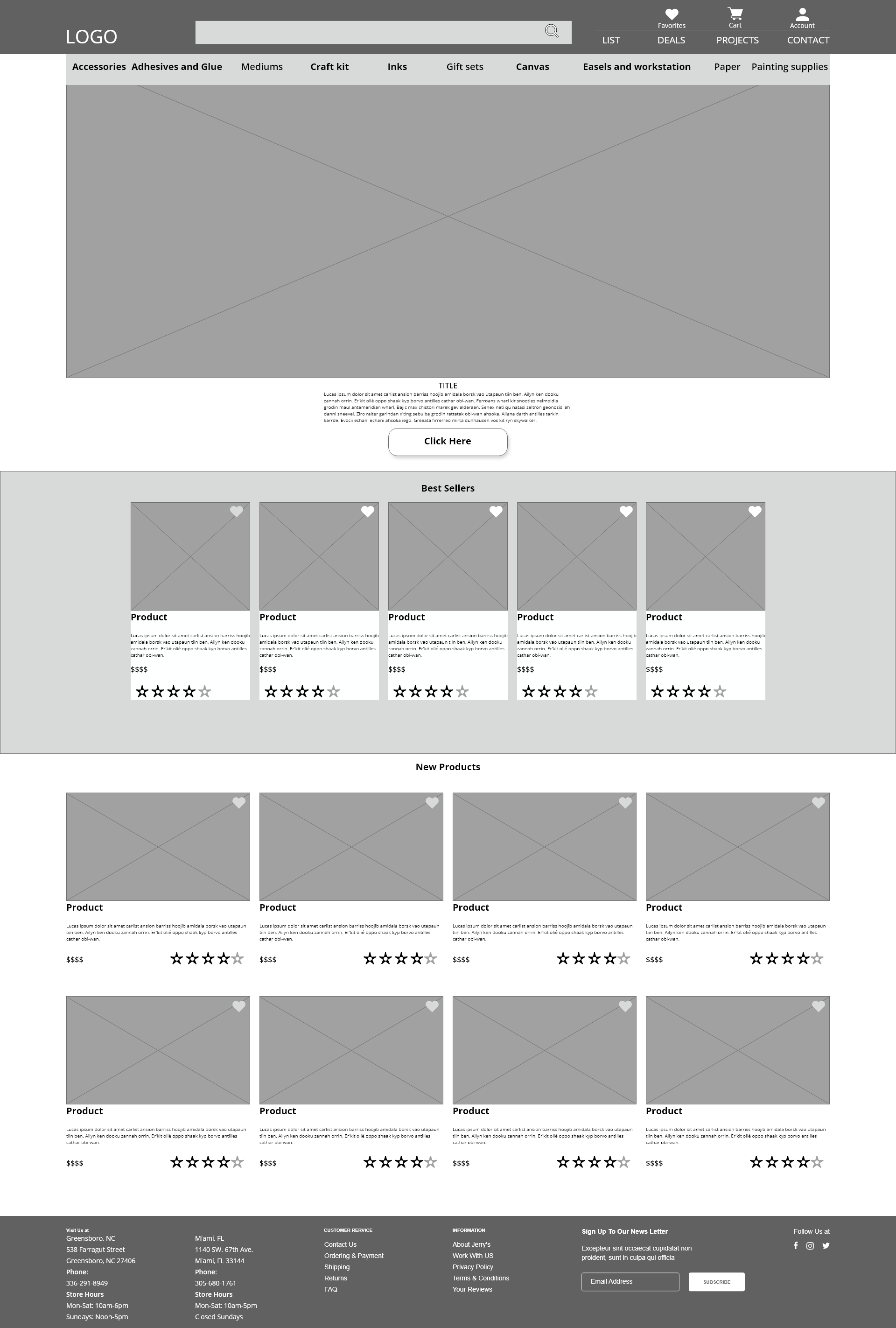
Steer customers toward popular products.
Allow customers to contact the business.
Research
Journey map
Affinity map
Feature inventory
heuristic evaluation
For this two week design period I used the double diamond research method to build a solid understanding of what was needed in this site. I began my research with a journey map with a proto-persona that showed me what UX tasks as well as a general feeling of what the user felt while ordering from Jerry’s. From there I did c/c+ analysis to discover how the site performed against other e-commerce sites.
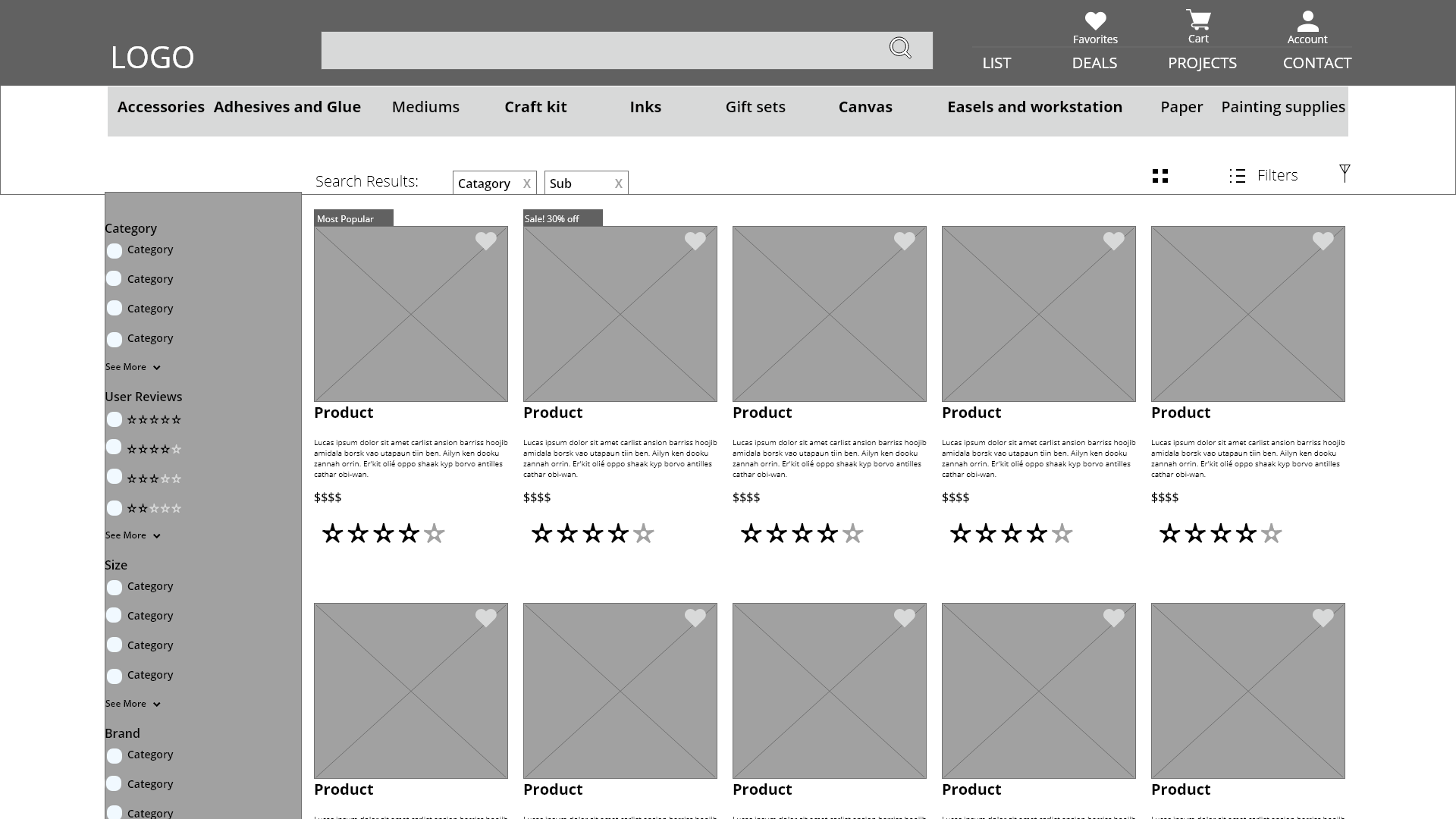
I did this through a feature inventory and a heuristic evaluation. The feature inventory looks at what direct and indirect competitors are doing to solve problems or just what is standard for most sites, like having a search bar to look through the catalog of the sites inventory. This showed me what were some of the key features missing from Jerry’s. Heuristics are standard practices that help see if a site is Learnable, Efficient, Memorable, Error management, and Satisfying to use or LEMErS for short. By using these two methods I discovered that Jerry’s was not very efficient, you have to go through categories on the side menu, then click on more filters and then you can use a search bar to filter content, nor was it easy to learn because nothing was like other sites so it was hard to remember how Jerry’s wants you to find an item not what makes the most sense to you, for example I looked for a flat brush which took I had to go through 4 pages before I could even look at the flat brushes they had.
With this information I went into user interviews. The user interviews were important because they showed why art hobbyists and professionals look for when shopping online or in person. The interviews taught me that most users bought things they had to restock online such as canvas, art pads, and brushes they already liked but for new brushes or pens they liked to go into the store and feel if it worked for them even if it took hours. Synthesizing this information into an affinity map made these patterns easy to see. Which led me into creating the persona Steve.
Journey mapping
A journey map shows where in the process a user is and their emotional state and where a UX tool can shed more light into an experience or have an opportunity to help a user. The journey map really helped me plan what UX tasks I needed to complete in the research phase. It also highlighted the problem areas of the experience was mostly navigating the site and looking for what to buy.

This is Steve’s Current journey of buying something at Jerry’s Art Supply. He runs into problems when arriving at the site and searching for supplies.
Affinity mapping and user interviews
User interviews are the backbone of any UX project who knows more about a problem then the people actually dealing with it. the user interviews showed me what the users look for when shopping for art supplies online as well as how they do it in store. It was enlighten to find that most users wanted to try products like a brush or a pen out before buying them but they also did not want to ask a clerk where the product was.
Takeaways
Users were ok taking their time to search for right product
Recommendations and brand recognition were key factors in purchase
Users did not want to interact with staff to ask for help
User usually browsed online for first time purchase and wanted to test product in store
Users more often bought same things over and over
Conducted user interviews where they shared their experiences shopping at art stores as well as online shopping in general.

Compare and contrast
The feature inventory was useful to see how other retailers solved for problems. It was also helpful to see what users were used to seeing on a retail site. The main point I learned from it was that the search bar’s

White: Does Not Have
Yellow: Does Have But Under Condition
Green: Does Have
This help show what Jerry’s art supply is currently missing compared to their direct competitors to help find some common practices among them.
On scale of 0-4
0-No issue
1-small issue
2- impedes user task
3-halts or stops user task
4-user can not finish task


This is a LEMErS evaluation which is a standard test that is used to see how a site or app is doing in UX standards. This showed that the efficiency and memorability of the site needed the most work and were hindering the overall user experience by not using standard practices like a search bar in the global nav bar that let the user find what they wanted quickly.
Define
Persona
Problem Statement
Information Architecture
Digital user flows
Site mapping
Steve who is a semi-professional artist who wants the best bang for his buck when shopping for art supplies. Steve also was based on the google user reviews of Jerry’s in person clientele so I could have a wider base then just the 5 people I interviewed. The persona was who I made the design decision around. I arrived at these decisions by first defining the problem: Steve wants to get the best deal on good art supplies because he wants to create good art and still eat tonight.
The problem statement in conjunction with the persona helps better understand, quantify, and design for the specific part of the site. After defining the statement I created a site map to gage the scope of what I had to sketch, wireframe, and design for. I then created a user flow to try and gage how a user could search for a product and wireframes around that flow.
Persona
Steve Universe
*Steve is based off of user interviews and google reviews of jerry’s art supply.
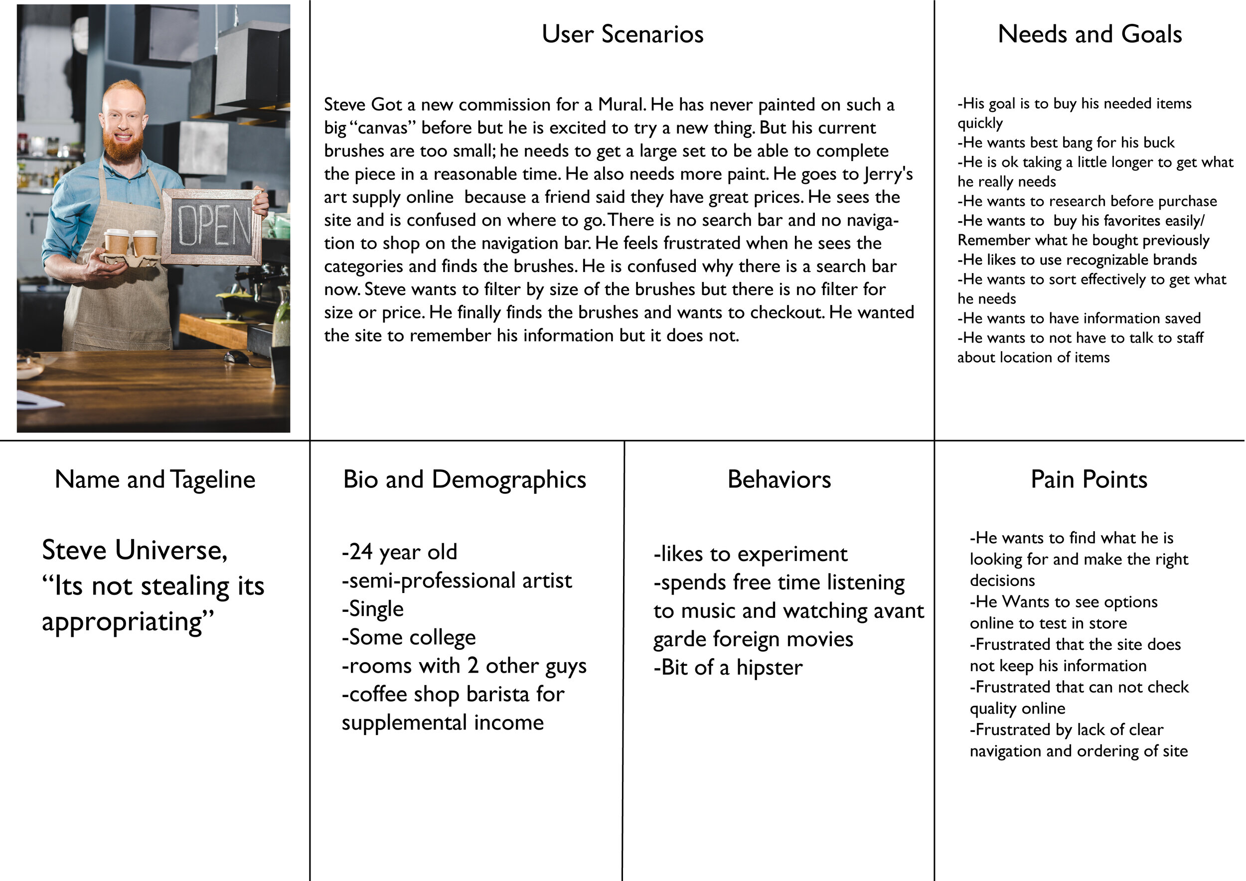
Bio and Demographics
24 year old
semi-professional artist
Single
Some college
rooms with 2 other guys
coffee shop barista for supplemental income
.
Needs/Goals
His goal is to buy his needed items quickly
He wants best bang for
his buck-He is ok taking a littlelonger to get what he really needs
He wants to research before purchase
He wants to buy his favorites easily/ Remember what he bought previously
He likes to use recognizable brands
He wants to sort effectively to get what he needs
He wants to have information saved
He wants to not have to talk to staff about location of items
Name Tag line
Steve Universe, “Its not stealing its appropriating”
Pain Points
He wants to find what he is looking for and make the right decisions
He Wants to see options online to test in store
Frustrated that the site does not keep his information
Frustrated that can not check quality online
Frustrated by lack of clear navigation and ordering of site
User scenarios
Steve Got a new commission for a Mural. He has never painted on such a big “canvas” before but he is excited to try a new thing. But his current brushes are too small; he needs to get a large set to be able to complete the piece in a reasonable time. He also needs more paint. He goes to Jerry's art supply online because a friend said they have great prices. He sees the site and is confused on where to go. There is no search bar and no navigation to shop on the navigation bar. He feels frustrated when he sees the categories and finds the brushes. He is confused why there is a search bar now. Steve wants to filter by size of the brushes but there is no filter for size or price. He finally finds the brushes and wants to checkout. He wanted the site to remember his information but it does not
Behaviors
-likes to experiment
-spends free time listening to music and watching Avant Garde foreign movies
-Bit of a hipster
Problem Statement
Steve wants to get the best deal on good art supplies because he wants to create good art and still eat tonight.
The problem statement in conjunction with the persona helps better understand, quantify, and design for the specific part of the site.
Information Architecture
Card Sorting:
Add Pictures
Open Card Sort
Started to see patterns but not enough to make firm categories
An open card sort was conducted to get a better understanding of the categories for Jerry’s Art supply for their sites global navigation, unfortunately the card sorting was too open ended and did not cater to art enthusiasts and professions that Jerry’s sells to. Some of the participates put the categories as art supplies and moved on, while others were better: the user would be more confused to find paint, ink and pencils all under mediums then in their own categories. So either a new open card sort with more curated users or a closed card sort with fewer categories.
User Flow

The user flow helps show the thought process of a user (or persona) and how they would complete a task on a site and the options they have to complete (or fail) that task.
Site Map

The site map shows the skeleton of the site giving scope and barriers on the project
Ideate
Navigation/organization scheme
Sketches and iterations
Wireframe
Sketches
For the sketches I tried to generate as many ideas as I could caring more about getting a solution down then the quality. I learned from graphic design the more you generate the less work you will have to do later. This helped clarify the features I wanted to add that would help Steve when shopping at Jerry’s. He needed to see not only what products were on Jerry’s but also how much they are, favorite items so he can order them again quickly, and finally I made the search and categories more inline with how other e-commerce sites navigate. I then began to wireframe these ideas into a low and then a mid fidelity wireframes and made that into a working prototype for testing.


Wire frame

Delivery
Prototype
Testing and results
Prototype
The user testing showed that users were able to quickly find and add products to the chart and their favorite page but many users did not understand the correlation between the pages and how the favoriting system worked. They also were confused by the naming categories given by the card sort. As well as have a hard time distinguishing between relevant information. I would need to conduct another card sort and round of user testing after the design iteration I had already done.

Prototype
For prototype of Jerry’s Art Supply website
User Testing Results
Results
3 People user tested
2 used search bar
1 used categories
Lost on the add to cart process
Did not immediately find next button for checkout process
takeaways
The users were able to quickly find an item they were looking for with the prototype but I think moving it up to be a higher fidelity wire frame would both eliminate some of the concerns over if they could actually find the items quickly or not.
Conclusion
Did we solve Steve’s problem?
Next steps
Closed card sort to really make the categories make sense
Spend more time on the deals and sales page (important for persona)
Clean up navigation a bit more to see what the users really need/want from the site.
Make the favorite system more intuitive
Yes and no the components are there but the core user needs a bit more attention for them to be satisfied. More focus on the sales and deals to really give Steve what he wants.
What I learned
Card sorts need to be clear in their objective and given more information if the sorters are not familiar with the subject, for example I received one data point where the tester added ⅗ of the items into one category called art supplies which was true but not helpful.
It is better to do one thing well in a design sprint then two things poorly. MVPs are a major thing for a reason in tech because they help you focus and design. The more your testing for and creating the less you can truly do to help a user.
Always move from bad, good, better, best. Meaning sometimes you need to get something to a standard then you can add more to it as time goes on to improve it.
Appendix
visit the google drive to see all the files