

Research
Define
Ideate
Delivery
Goals
Work as a team to solve for the users problem
Find a way to incorporate the team into aspects of the project that they are strong in
Project Setup Phase
Create your Functional Team Plan
Create Your Project Plan
Identify competing products/services and investigate their design strengths and weaknesses
Conduct user research to identify user group and identify problems and/or opportunities to develop a design solution for that user group
Business goals
Stay in the style guidelines of TED
Work within the existing brand guidelines
Establish a design system that is aligned with the company brand
Process
For this project I used the double diamond method which splits the UX process into 4 phases. 1.research 2.define 3.ideate 4.delivery. research focuses on finding information about the current situation like who uses Jerry’s and what do they use it for? Research also is used to see what others are doing to solve for similar problems. The define phase is used to try and synthesis the data gathered from the research phase into actionable steps. The ideate I used to think of different solutions to solve the users problem. The deliver phase is about what needs to be given off to either present or handed off to a developer.
The Team
The team consisted of Oscar, Darcie, Matt, and I. We did not know each other very well at the start of the project. Oscar had little to no team experience and Matt was used to working alone on projects. Darcie had taken some training on scrum and we implemented some of it in the project plan, She also had experience on teams in the tech workforce. I had experience on setting up team norms and leading meetings.
Team Plan
We had two weeks to not only begin to function as a team but also deliver a mock up of our UX process on the TED app. I moderated as we set up our team plan, which included team norms, how, when, and where we communicated. When was especially important because we were in 3 different time zones and all working remotely. After establishing some personal goals for the team and ground rules we did a swot analysis to try to better understand who each of us were and how we could help the team and areas we might need help in.
Project Plan
We began by assessing what UX process we needed to do to see a clearer picture of the situation and wrote out every deliverable we might need. Next we laid them out on the double diamond which breaks the UX process into four parts, I suggested we each take a leadership role in each of the parts. The reason for this is so each member felt that they had true ownership of a part even if they were not the one doing everything in that section. After that we tried to see what time would allow within the two weeks and created a Kanban board to keep track of who was doing what and when. Oscar took the lead role in Research, Darcie was the leader for Define, Matt was leading in Ideate/Design, and I was in charge of deliverables. I was not in charge of making every deliverable. I made sure they were completed and in the right file format and location on the google drive where we stored our files. I also was in charge of the final deliveries to get them to the client.

TED’s Mission Statement
TED is a global community, welcoming people from every discipline and culture who seek a deeper understanding of the world. We believe passionately in the power of ideas to change attitudes, lives and, ultimately, the world.
TEDs mission statement help keep my teams aligned with TEDs business goals. We wanted features that would emphasize what Ted does well already. People love Ted talks and want more of them but none of the users even knew about. So we asked what would make them want be excited to share the app after finding out about it.
Find on TED.com
Research
Journey Map
C/C+ Analysis - Feature Inventory
User Research
Journey Mapping

My teammate Darcie created this Journey map based off of a proto persona that I helped develop. The journey map helps my team understand the feelings of the users who use the TED app. This chart illustrates not only when in the process of using the app the user is at but also their feels and some UX tools we can use to better understand the problem or an opportunity to make something better then the current system.
Feature Inventory

For the feature inventory I looked at both popular social media video apps as well as apps dedicated to online learning to see if the spreading of ideas and how TED talks are viewed.
User Interviews and affinity mapping

Key takeaways:
Common themes we discovered through data synthesis revolved around recommendations, navigation, and engagement
How it drove our next steps:
TED users appreciate relevant recommendations that pique their interests.
The organization of videos keeps users engaged with the app.
Our users value a mobile experience that is modern and customizable to fit their individual schedules.
The user research helped define the problems users were having as well as what they liked about either TED itself or other platforms to help create the best experience from the insights learned from their wants and needs.
Define
User Persona
Problem Statement
Moscow Feature Sort
Feature Prioritization Matrix
Persona

Problem Statement
“Ivy loves TED but needs a starting point to help direct which videos to watch because there are too many ideas to pick from, leaving her annoyed and frustrated.”
The persona was created from the user interviews and from looking at data that we found for the proto persona that said most Ted listeners were from higher Education such as graduate students. We also found that teachers used Ted very differently from most other and were viewing them with more of easy ways to communicate ideas to a class in a short amount of time.
The problem statement was drafted by Oscar and i by asking the question why? Why does ivy want to find Ted talks to listen to? Why does she need it? And how would she say it?
Feature Matrix

For the feature matrix we took every feature we could think of making, and still liked and tried to think of what is the hardest to do to easiest (because time constraints would not let us do all of them). And what would ivy get the most use from? We really liked some people for the features such as transcription of the talk but felt that did not solve ivy’s problem. So we scrapped it.
Ideate
Sketches and Design Studio
Style Guide
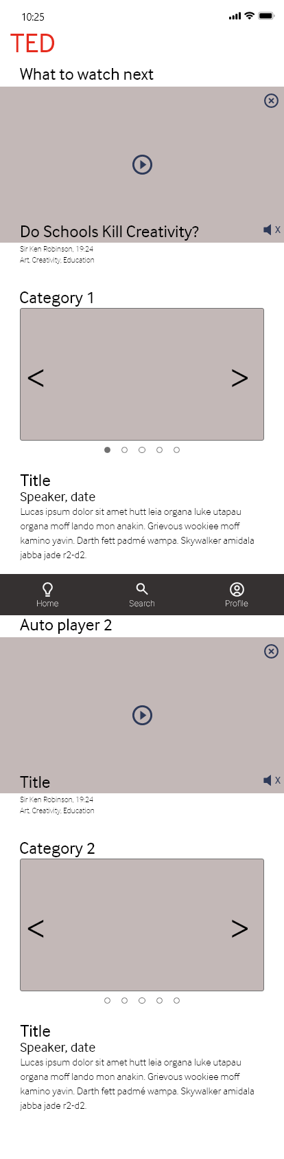
Wireframes
Mock Ups
Sketches
For the Ideate stage my team did a design studio to generate ideas and try to think through ideas that could help the TED app. This sketching of ideas combined with the feature matrix aligned us on which features we should focus on. After two rounds of sketching we had Matt create a few high quality drawings for a low fidelity wireframe which we then wireframed and I brought back together to create our first prototype for user testing.


Wire Frames


Delivery
User Testing showed that some of our ideas such as a search bar for the discover page was a little confusing as well as users wanted to search from the home screen to find the content they wanted more quickly. After the second round of wireframing I took the wireframes to a mockup and prototype for presenting. During the other phases I was also making a template for our group presentation so the slide deck would be more consistent and used similar colors to that of our style guide to better represent the TED brand.
User Testing
Results
Users expected the home page preview video to have a full-screen option
Weren’t aware the prototype could scroll
Lack of clear understanding on the location of the “Discover” tab
Users wanted a search bar at every page to have a more “familiar” search experience
Takeaways
Users wanted a search function from multiple places
Did not understand locations of the discover page
No confusion regarding light bulb icon because of the “home” button label underneath
prototype
This is the high feudality prototype that I made for the project.

Design Iterations

Conclusion
Did we solve the problem?
Yes, we helped Ivy find pertinent videos more easily and gave her access to more options that appeal to her individual interests. She is able to choose specific videos to suit her mood and schedule. Furthermore, she has reasons to return to the app again and again with features that allow her to easily discover new talks when she is open to suggestions.
Overall the team worked together extremely well considering the short time frame, finding out each other's work flows, and how to communicate. There were some hiccups but we always tried to be upfront and open with each other and came together to create an interesting solution of how to get the Ivy to a video faster and more relevant. The TED app does need more work especially on its search functionality and sorting but that is for another time and maybe another group.
Next Steps
More user testing
More features from the feature matrix like transcription
Continue to refine and develop search functionality by doing a card sort to better categorize the topics.
Revisit the features we did not get to work on like the transcript for accessibility
Revisit the on boarding process
What I learned
Sometimes it's the small things that can really change a users experience
Its ok to look back and see that the user may have been better served if you focused on another area but how do you find that out more quickly
Push for the users needs not for what is flashy and innovative
Sometimes typefaces do not work
Appendix
Google Drive
If you would like to see more of individual files you can checkout the whole process here.