

Easel.ly
Summary:
This Sprint was focused on Giving the client usable research and testing of their Infographic builder; Easel.ly, a website application. Easelly has had millions of infographics made using their platform and one of their core users was teachers and students. During this sprint, my team and I created a prototype for tooling, SUS usability score, and worked with the constraints of a new redesign that the site was undergoing at the same time.
Team members:
Devin Kitada
Ezra Shelton
Jared Carpenter
Martin Brown

What is Easelly?
Easelly is a web-based infographic builder that has created millions of infographics primarily for schools, governments, and small businesses. Users can start from scratch or create their own based on templates.

Problem:
Vernon Southward, the CEO of Easelly, approach my team to help find what his users needed from his infographic templates and what were some best practices for making templates.
Goal:
To create a more student-friendly version of Easelly.
Process:
This was a one-month sprint in which we worked closely with the CEO of Easelly to hear why students were having a hard time with the program. For this sprint we used the double diamond method, which broke the sprint up into 4 phases: Discovery, Define, Design, and Deliver. My team was in multiple time zones as well as the client, we used scrum-light techniques like a kanban board, daily stand-ups, and a small team of 4. We also gave Vernon weekly meetings to make sure he was on the same page especially in terms of the scope of the project.
Discovery
User Interviews
Contextual inquires
Hot Jar/google analytics
User Interviews
We interviewed teachers who taught from 3rd-11th grades about how they would use and teach with a tool like Easel.ly. We also asked about what the students would be expected to do with this tool and what kind of projects they could expect to assign them.
Contextual Interviews
40 minute interviews where we used the same search parameters of teachers (3rd-11th grades) and gave them materials to create an infographic. Through this we could see how they used the program and what were pain points from the actual program.

HotJar and Google Analytics
My team and I went over data given to us by Easel.ly.The Google analytics included Customer Tickets that had unsubscribed or had other problems. I looked through these tickets to try and find common themes to create a more comprehensive idea of what elements were causing trouble. For HotJar I looked at where people were going and what they were using on the program.
Define
Affinity mapping
Personas
MSCW
MVP Matrix
Affinity Mapping
After combining the different interviews, pain points, and trends we grouped like ideas to better understand the problems of Easel.ly. Some of these trends were: Wifi connectivity of the students, attention spans, unfamiliarity of programs, and age of students.
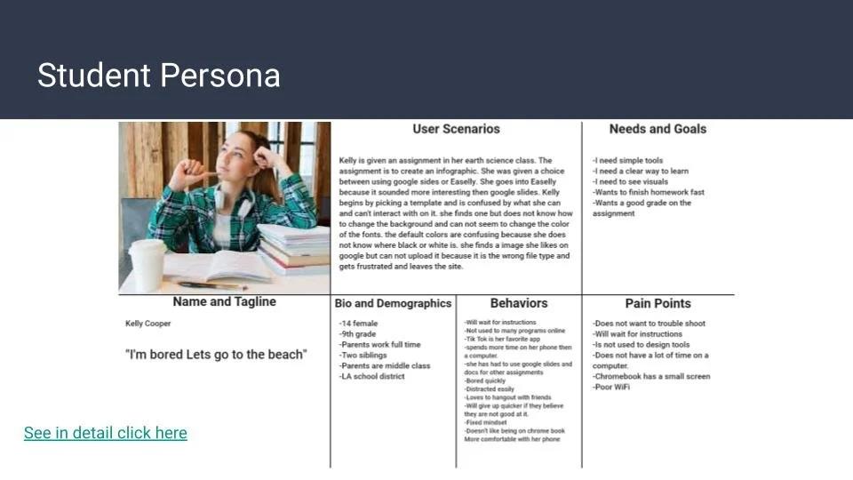
Personas
Two personas were made to give an understanding of what was needed for a teacher and what was needed for a younger student; from grades 3rd to 8th. The teachers needed more clear instructions, low bandwidth, and easy for a child to understand. For the student, the apps and programs they were already familiar with like tik tok and Snapchat were the base of their technology literacy. Moving forward these were important points for our design thinking.


MSCW
We used the MSCW method to try and figure out what were important features to design for. Like using iconography students would recognize to make sure what they needed was clear and upfront. We also used this to try and cut back on features that would not be as helpful given the restraints of time and manpower we had.

MVP Matrix
The MVP Matrix was the last part to help filter all of our ideas of possible features for the app and try to focus on what was important. It helped visualize what would give us a big impact on the amount of time put in.
Design
Design studio
Wireframes
Prototype
iteration
Design studio
For the Design studio, we used the crazy 8’s with the team and the CEO to try and to come up with designs for the features we had highlighted as important from our previous exercises like the MVP Matrix and MSCW. I facilitated this meeting and gave everyone 15 minutes to come up with designs that could be used in the tool. After time was up we shared our thoughts and designs and began to focus on sketches we liked and wanted to flesh out more. I then gave everyone 15 more minutes to either come up with new ideas or refine ones already shown. After that, we combined the different ideas into one design sketch.

Wireframes
After taking the ideas from the sketch we created wireframes of the ideas we had come up with from the design studio (sometimes there were multiple ideas of the same feature). After making low fidelity wireframes we began to try to combine the parts we liked from each of them into making one cohesive design. After settling on the design we then began making higher fidelity wireframes.

Prototype
The Prototype was made with Adobe XD and was meant for testing out our design. Making it function as the actual tool was not practical so we tried to make it give an idea of what the tool could do.
Try the prototype yourself: Click Here
Iterations
After making the prototype we had several users test the functionality of the prototype and see if any changes needed to be made. Some things were well received while others like the zoom needed to be clearer on what the function did for young students.
Delivery
Sus usability score
Best practices documentation
Clear labeling
Sus
System usability score or sus was used to test the performance of the old Easil.ly site to the prototype. We asked users to rate the old site and had a different group rate the prototype. The results should also be taken with the understanding that they were using a prototype and could have been more lenient in their scoring because of that.
Best Practices Documentation
The Client wanted a document to help his staff as a reference and guide for templates and tools. We compiled the research notes into a more understandable document for him and his team to use.
Clear Labeling
We compiled all of these into a single document that was clearly labeled to help navigate the work we had done and not have to search through folders or records to try and find a single thing.

Conclusion
Conclusion
We learned:
Teachers need to be able to implement a program smoothly into their digital classroom
Students need a familiar, intuitive program that allows them creative freedom
Programs need to be streamlined and “light” to limit bandwidth issues
What we achieved:
Designed a simpler interface that arranged tools and features based on user feedback regarding expectations, needs, and goals.
Empathized with teachers and allowed them to step into their student’s shoes and create an infographic, providing us with invaluable data that will help Easelly visualize their users going forward.
Tested the usability of Easelly’s current site compared with our prototype, helping to draw out data points that supported the findings of our research.
Had a lot of fun!!!
Next steps
Next steps
More usability testing
Improve prototype for more accurate testing
User interviews with students
More sus data to more accurately define what is and is not working